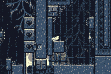
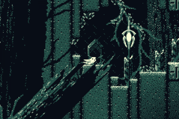
Gable sprints through the upper chambers of the new tutorial map.
After quite a bit of work on surrounding aspects of the game, like the website and press kit, among other things, I’ve finally gotten a chance to get back to working on some of the upcoming updates to the game itself.
The main thing I want to have released before I start into the press side of things, and begin getting word out for the upcoming Kickstarter relaunch, is the new and significantly redesigned tutorial level. It’s now complete, and I’ll be releasing it in the next game update, which should be fairly soon.
As I mentioned in a prior post, the original tutorial level was a repeatedly expanded version of the very first level I ever created for Down Ward. Since then, I’ve built a lot of levels, and worked through a wide array of design challenges and revisions. Having seen many people play through the game, I’ve gotten a pretty good feel for what kinds of areas have a nice flow to them, what can be confusing to players, and what mechanics can be better introduced and reinforced in the tutorial.
So I’ve rebuilt the tutorial from scratch, and I think it benefits quite a lot from being a purpose-built introduction, rather than continuing to squeeze tutorial segments into the increasingly confined space of an existing level.

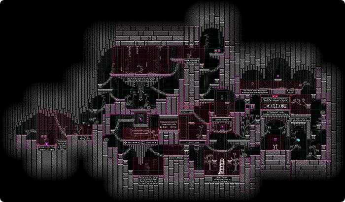
Shown above, the new level is much more spread out, and the rooms and corridors are more open.
As a little side note, this is a view directly from the editor, which is why there are a variety of pink rectangles and objects. The redish-pink rectangles stretched over empty space are trigger volumes, which fade-in the tutorial text when Gable enters them. The more violety-pink rectangles over the level geometry are override collision geometry, which I mainly use to smooth out block seems, and optimize physics performance. I generally use shades of pink for the editor objects I create so they’ll stand out.
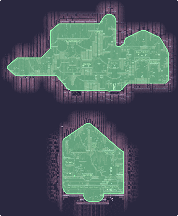
Below is a rough size comparison of the new tutorial (top) compared to the existing tutorial (bottom).


